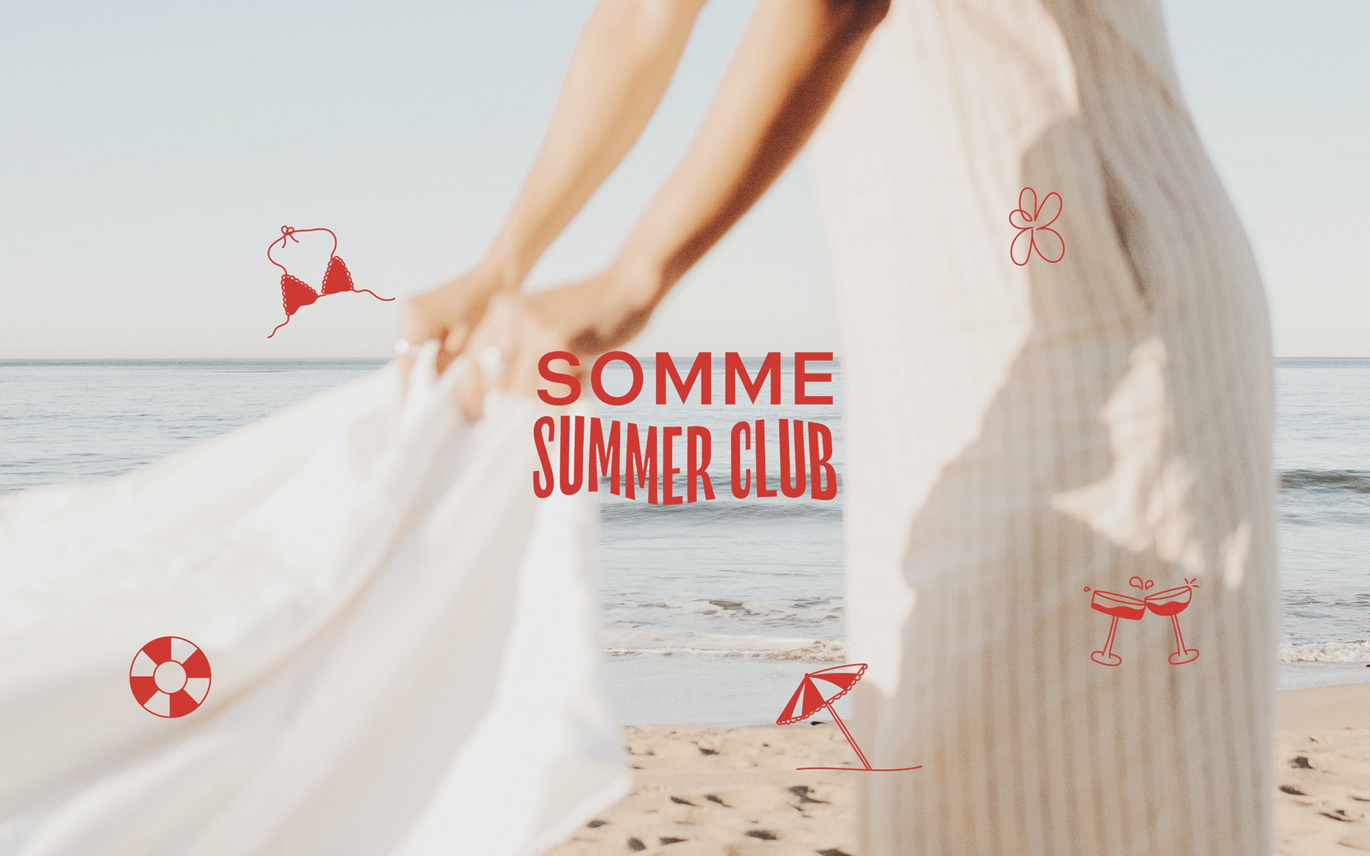
Somme Summer Club
CLIENT: SOMME
LOCATION: Melbourne, Australia
CATEGORY: Doing good for people and the planet
SCOPE: Campaign Identity
SOMME came to me needing a hand in bringing their summer campaign identity to life. The challenge was to use their existing logo and colours, to create a new wordmark that would successfully encapsulate all the vibes of their Australia-wide summer campaign.
We created a brand new wordmark filled with movement and waves to encapsulate all the smooth things we love in an Aussie summer – a cheeky bev, a dip in the ocean and the essential sunscreen.
We created a set of the most summery icons you’ve ever seen to compliment the wordmark, which were rolled out across web, print, merch and socials.
Get your hands on a couple of their cans in Dan’s and BWS.

How is this different?
SOMME are an Australia-wide bev brand who exist to bring the summer feeling, year-round. Their products are all packaged in cans, meaning they’re not only a super environmentally friendly option (side note – did you know aluminium is infinitely recyclable?) and make on-the-go summery vibes a breeze – even in the midst of a Melbourne winter. They’ve taken a totally minimal approach to their packaging, and now their gorgeous pink cans somehow jump off the shelf and fall into the palm of your hand - crazy!


